Storytime: Redesigning Goodreads for the Readers Who Never Left
Role: UX/UI Designer
Duration: 3 Months
Process: User interviews, Affinity Mapping, Sitemap,
Card Sort, Tree Test, Paper Prototyping & Mid Fidelity Prototype
Tools: Figma, FigJam, Ux Metrics
Abstract
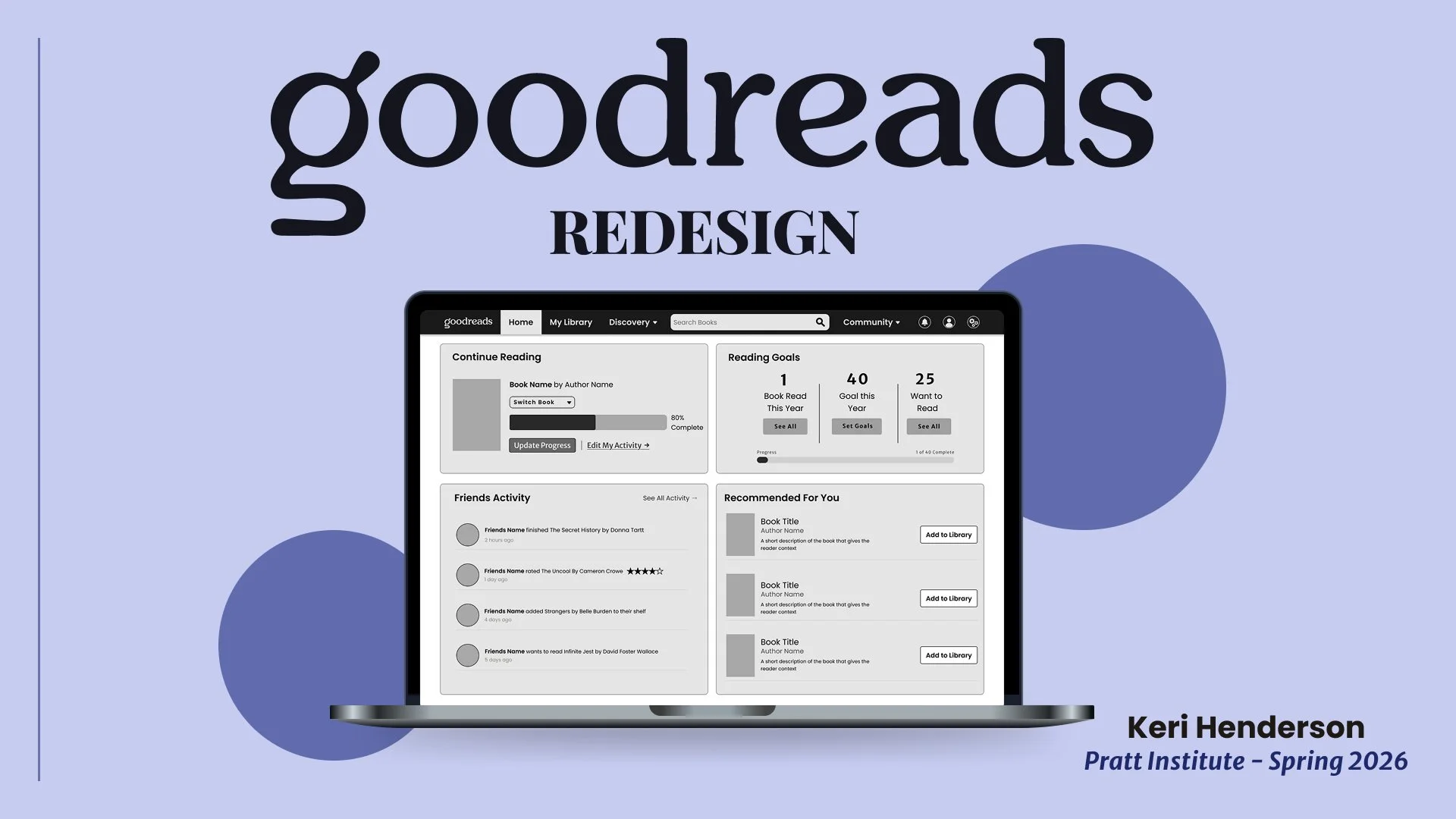
The moment someone suggested we redesign Goodreads the reaction was instantly one of recognition — we all use it, we all had opinions on it, and we all saw the same problems. As three avid readers we set out to understand what users’ pain points through interviews, card sorting, tree testing, and paper prototyping. My focus was on the Homepage and Advanced Search, two areas I felt had a real opportunity to change drastically.
‘Good Enough’ Isn’t Good Enough: The Problem with Goodreads
In July 2025, Goodreads updated its logo for the first time in 20 years, likely as a response to receiving more competition from Storygraph and Fable (Snelling, 2025). Readers however noted that this was largely a cosmetic redesign, it ignored the features they had actually been asking for. That distinction is visible in the interface itself. Figure 1 shows the current homepage: the navigation structure, search bar placement, and core tracking tools are unchanged from previous versions — only the logo and color accents were refreshed. Figure 2 makes the same point even more directly. Goodreads’ ‘advanced’ search is still a single text field with three radio buttons beneath it, the exact structural limitation readers have been flagging for years. Our redesign addressed what Goodreads is continuing to ignore.
A website stuck in 2009
Goodreads is a book tracking platform with over 150 million users , its interface does not reflect this kind of user base (Norberg, 2025). It feels like it was made in 2009 and never updated. The navigation is confusing, key features are buried under ads and irrelevant content, and search somehow makes it difficult to find books. Tracking personal reading is clunky, and the 1–5 star rating system feels too restrictive to capture how users really feel about a book.
In July 2025, Goodreads updated its logo for the first time in 20 years, likely as a response to receiving more competition from Storygraph and Fable (Snelling, 2025). Readers however noted that this was largely a cosmetic redesign, it ignored the features they had actually been asking for. That distinction is visible in the interface itself. Figure 1 shows the current homepage: the navigation structure, search bar placement, and core tracking tools are unchanged from previous versions — only the logo and color accents were refreshed. Figure 2 makes the same point even more directly. Goodreads’ ‘advanced’ search is still a single text field with three radio buttons beneath it, the exact structural limitation readers have been flagging for years. Our redesign addressed what Goodreads is continuing to ignore.
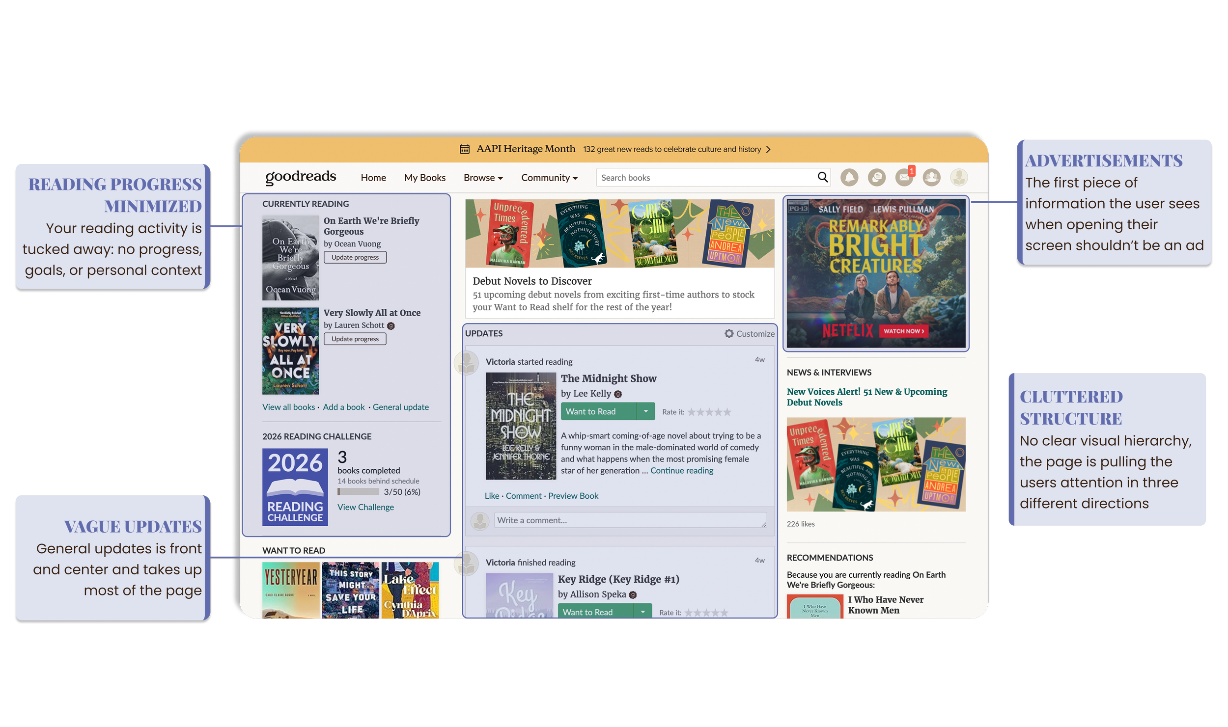
Figure 1: The current Goodreads homepage. Screenshot of goodreads.com.
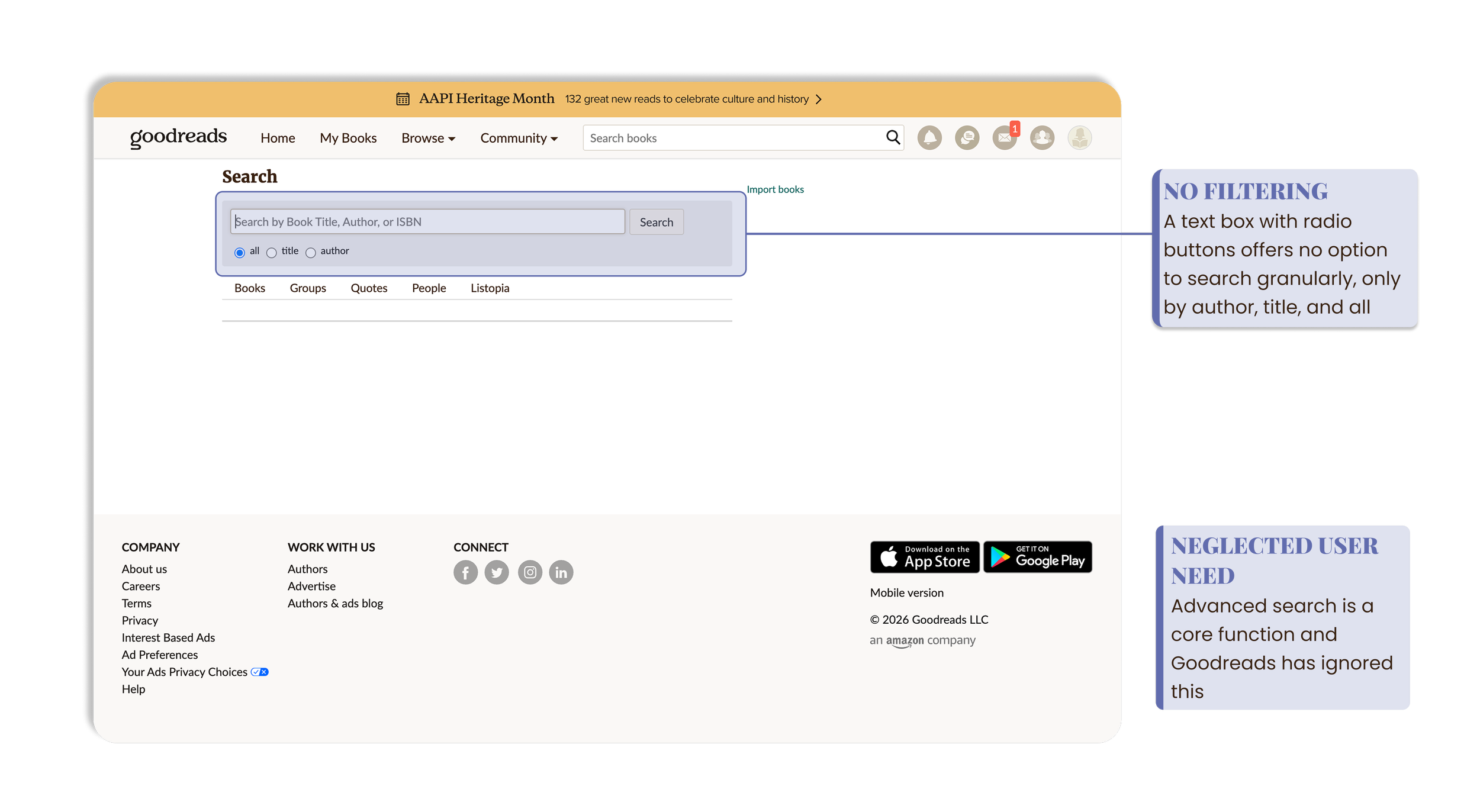
Figure 2: The current Goodreads search page. Screenshot from goodreads.com.
What Using Goodreads Should Actually Feel Like
Goodreads should be a platform where your personal library, local bookstore, and weekly book club all sit in one place. Reading is a fundamentally human activity, and the way people want to find their books reflects that. They want a trusted recommendation from a friend, a book store clerk, or the New York Times book reviewer, not an algorithm. Goodreads is instead a hodge podge of features hidden in a corporate, cluttered interface. People accept that because it’s all they’ve ever known.
The Process
Understanding Different User Personas
Our research process moved through five phases, each one informing the next and further developing our design. These included: user interviews, affinity mapping, card sorting, tree testing, and paper prototype evaluations. Every design decision in the final screens traces back to something a user told us along the way.
We gathered seven participants from our respective family, friends, and classmates — a mix of avid, casual, and social readers. We conducted moderated interviews that let participants speak freely about their experiences with Goodreads.
Three reader types emerged: the avid reader who tracks 20+ books a year and uses Goodreads as a personal reading companion, the casual reader who picks up a book every few months and occasionally logs on, and the social reader who discovers books through friends and social media and uses Goodreads primarily to log. All of these also tended to use Goodreads for verifying book ratings and reviews before picking up a book, or after reading it. Our redesign needed to have all three in mind.
What we confirmed was useful, but what surprised us ended up being the most valuable. The users had stopped trusting the interface. Most came to Goodreads just to track books and check ratings, largely ignoring the other features and going elsewhere for discovery. The interface according to one user felt “very Amazon” meaning corporate and impersonal rather than built with the readers in mind. Small but telling gaps kept surfacing too: no way to mark a book they Did Not Finish, no private note taking, and recommendations that were disconnected from their actual taste.
For the Love of Reading
Our user interviews revealed a clear lack of trust in the platform. Users often said they don’t get their recommendations from Goodreads, instead turning to friends, Booktok, book stores, and famous book clubs. Goodreads was typically used to verify a choice through ratings and reviews, or for general book tracking.
The rating system itself was a consistent point of frustration. One participant described the impossibility of rating a book like War and Peace on the same scale as a Colleen Hoover novel, comparing recognizing a classic as objectively great while finding it harder and less enjoyable than a beach read, and five stars just can’t capture that difference. As she put it “Are you going to 2 star War and Peace? That’s crazy” (P1, Qualitative study) People wanted a system that could rate difficulty, enjoyability, and readability separately rather than collapsing every book onto the same scale.
We came out of our research with a clear vision: make a platform that makes people love reading through it, not just tolerate it. Making Goodreads feel human and personalized was the only way to make it worth using.
My Focus
From the findings we uncovered across user interviews and tests, we each took on a different part of the redesign. I chose Homepage (fig 1) and Advanced Search (fig 2) because they were meaningful to me as a user. The homepage is where someone decides if they want to stay or go — Goodreads has retained its user base because they were the only ones doing what they provide for a long time, not because they have any staying power.
Search has become more critical than ever in an era where people expect instant access to information, and Goodreads makes it genuinely hard to find what you’re looking for. As a team we covered the full platform, but my focus on these two screens reflects where I felt the most could change for readers.
The Big Picture Narrows the Scope
As a team we compiled our interview notes and created an affinity map of the most revealing quotes and insights onto a shared FigJam board as seen in figure 3, Patterns emerged quickly around five areas: community, book tracking, advanced filters and search, book discovery and recommendations, and rating and reviews. Across almost every cluster, a common thread emerged: cluttered layouts with no clear visual hierarchy, making it hard for users to find what they came to do.
More groups surfaced than we expected and this is when we fully grasped how big of an undertaking a full Goodreads redesign would be. Community generated a lot of insights but we chose in the end not to take it on due to lack of time. The individual screens the users were most blocked by day to day were tracking, discovery, and search. Those were where people felt the most friction on their core reasons for using the platform, so that’s what we narrowed our focus on.
These clusters became the backbone of every design decision that followed. The homepage would act as the spine where key features merged into a personal dashboard. Advanced search would be built from scratch given the current search is just a bar with radio buttons as seen in figure 2. The book profile, ratings, and library would be made more intuitive and less cluttered.
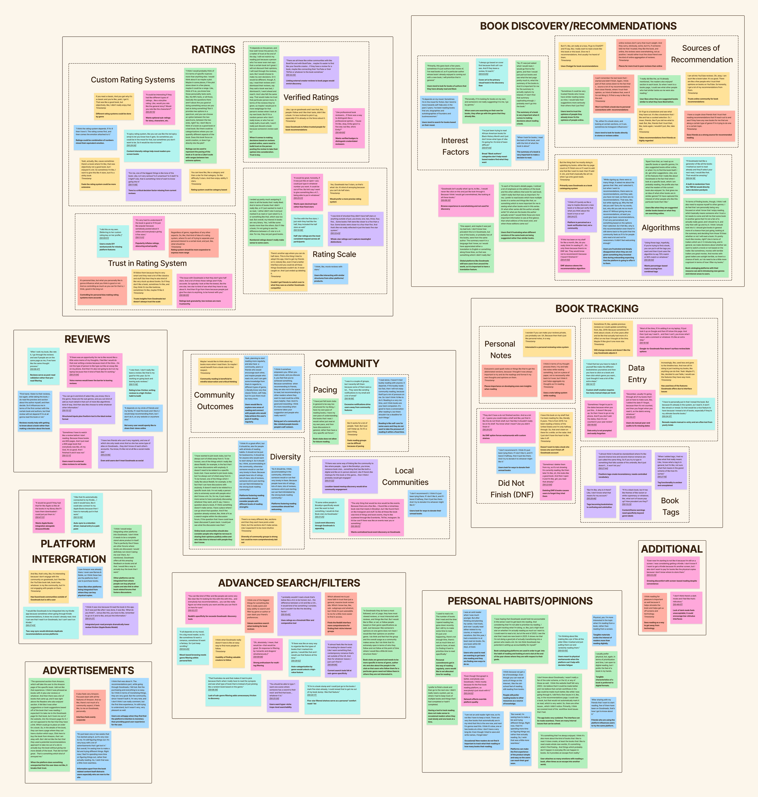
Figure 3: Affinity mapping session in Figjam. Ten clusters emerged from interview findings. View full board here.
Untangling the Navigation to Put it Back Together
Using UX metrics we ran a moderated open card sort with seven participants, giving them 42 cards drawn from three sources: existing Goodreads labels, renamed versions based on interview feedback, and new features users had told us they wanted including DNF, Personal Notes, and Trending Now. What the card sort gave us that interviews couldn’t was visual, measurable evidence of the mental model confusion users could only describe vaguely in conversation.
The results were clear in some areas and revealing in others. Personal reading cards like Want to Read, Currently Reading, and Finished were consistently clustered together with almost universal agreement showing users had a strong idea of what book tracking within the personal library should look like. Community features were consistently grouped together. But discovery was a different story, all of the participants created a version of an exploration group, but no two named it the same way or agreed on what belonged in it. Search, Browse, and Discovery were treated as interchangeable, which confirmed that having all of them in the navigation at once was causing real confusion.
The Homepage finding was equally important as participants placed wildly different cards under Home depending on whether they thought of it as a personal, social, or discovery space. This told us the Homepage needed to combine these three, acting as a snapshot dashboard rather than a single-purpose landing page.
Navigating Our Way to the IA
With our proposed information architecture built from the card sort findings, we put the structure into UX metrics and tested six participants on nine tasks during moderated zoom sessions. Each task was phrased as a real user goal rather than a navigation instruction, for example: “You’re in the mood for a thriller novel specifically. You want to narrow your options. How would you go about this?”
This phase taught me something I’ll carry into every project: as a designer you’re too close to your own work. Going in, the structure seemed obvious. Coming out, it was clear there were some cracks. Success rates were high at 93% with users generally ending up in the right place, but directness was only 48.1%, meaning most participants took wrong turns to get there. The gap between success and directness told us we had a labelling problem.
The clearest failures were author search, which was the only big structural problem, users couldn’t locate intuitively because it required too many clicks. Privacy, Preferences, and Settings felt too similar and users couldn’t identify what each one did. To fix these we added a dedicated author search field, consolidated the account labels, and redesigned the homepage to explicitly function as a personal dashboard with Friends & Following visible from the moment you open Goodreads.
Figure 4 shows our test information architecture versus the final information architecture. Changes made in response to Tree Test findings include label clarifications, Homepage restructured further as personal dashboard, Friends & Following added to Community, Author Search added to search filters, and account labels consolidated into Profile & Settings.
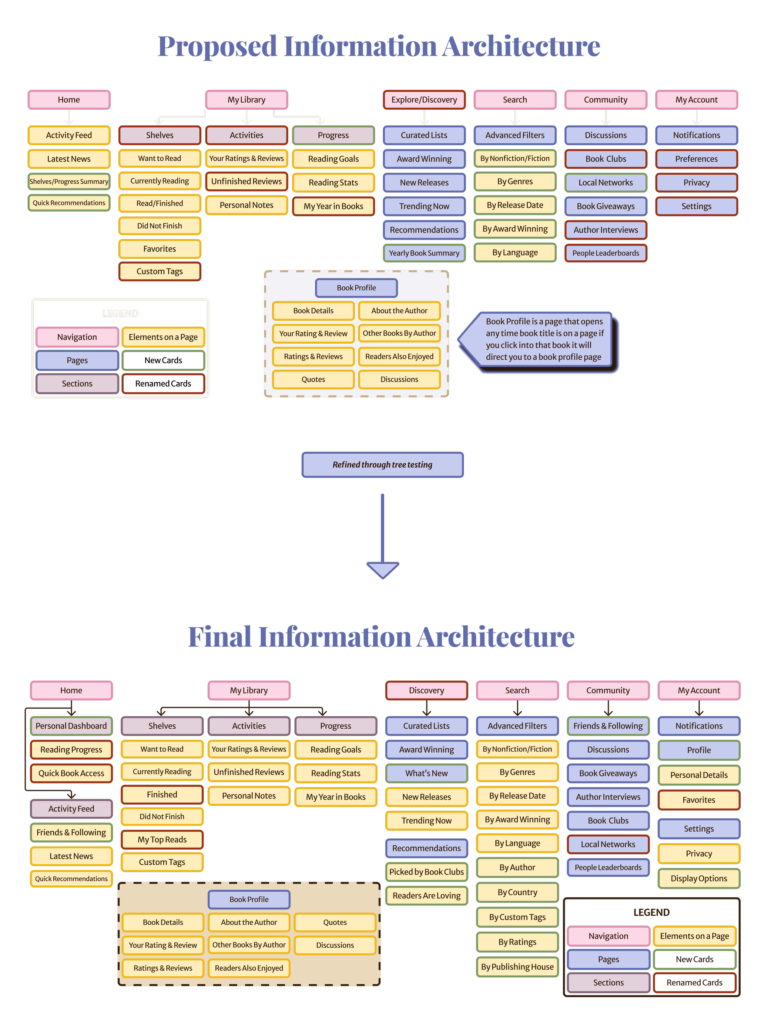
Figure 4: Proposed Information Architecture (top) refined into the Final IA following (bottom) tree test findings. Created by the Goodreads team. Spring 2026
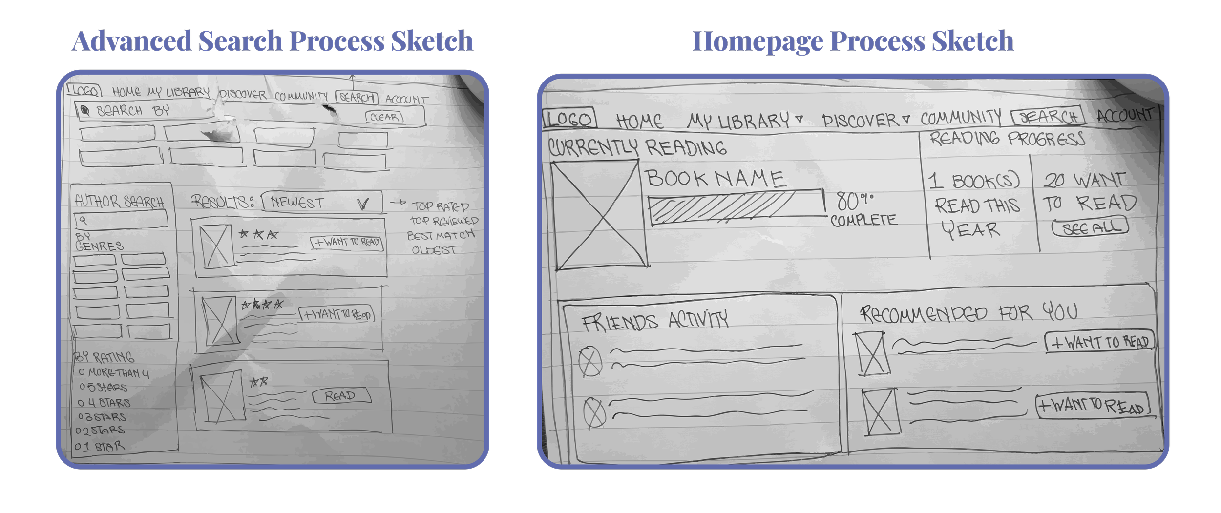
Figure 5: Process sketches of the Advanced Search (left) and Homepage (right)
Getting a Second Opinion
Before moving into the next test, we presented our work-in-progress to peers in a design process gallery format. The poster brought together our research findings, annotated screenshots of the current pages, and our early sketches across every page. Our peers offered an outside perspective at the right moment in the process before we turned our sketches into real screens. Fresh eyes on the work helped validate what we were confident was working, and flag anything that needed changing. View the full design process gallery board here.
Putting it to the (Paper) Test
With our final IA in place we built our screens for every major page — Homepage, My Library, Advanced Search, Ratings & Reviews, Personal Tracking, and Book Profile. We first made rough sketches (fig 5) before moving to static greyscale Figma screens printed on paper. We tested these with three participants across two tasks, filming with a tripod while one of us moderated and the other switched pages as participants pointed to what they wanted to click. Pages we hadn’t designed yet but were clicked on got an “under construction placeholder”. Images of how the test was simulated can be seen in figure 6.
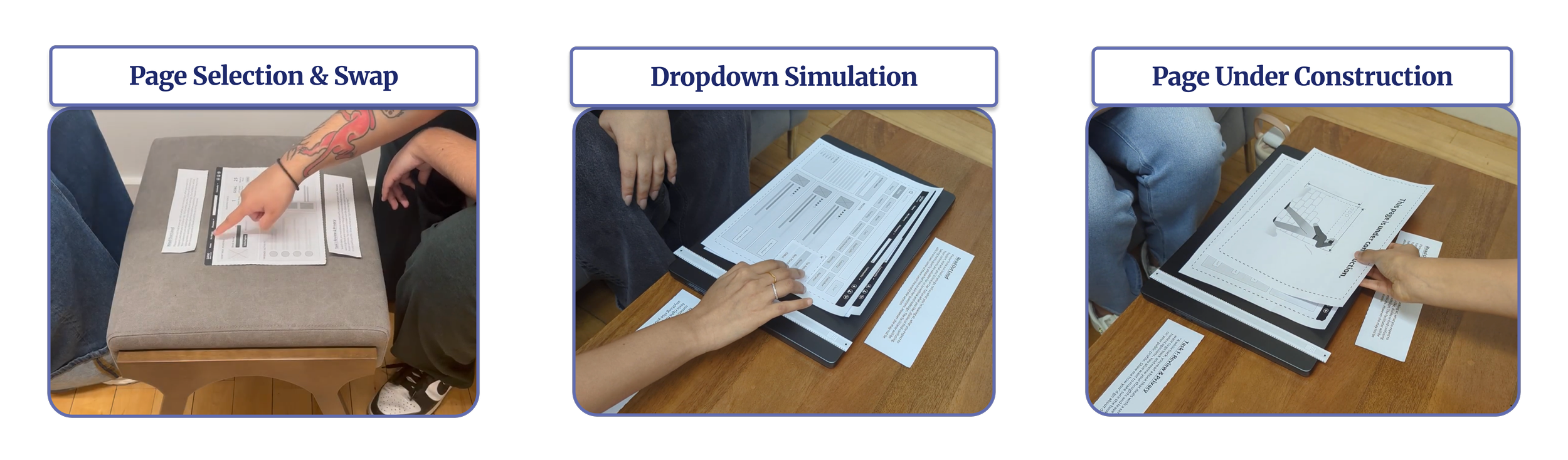
Figure 6: Paper Prototype Evaluations in action.
Task 1: Privacy Controls
“A while back, you read a book that deals with a sensitive personal topic. Now you want to go back and review your thoughts and leave a detailed review sharing your honest opinions. You also want to make sure the book and your review aren’t visible on your public profile. Show me how you’d go about doing that.”
All three participants understood they were looking for a privacy feature but none completed it cleanly. The core confusion was the difference between hiding a review and anonymizing one. The eye icon, anonymize checkbox, and post button sent conflicting signals with no labels to distinguish them.
Task 2: Advanced Search
“You’ve recently become obsessed with atmospheric stories set in school settings — think secret societies and morally complex characters. You want to find something with at least a 4-star rating. Find a book that feels right for you and learn more about it, then see if the author has written anything else you might enjoy.”
Users went to discovery first, not to the search bar as intended, indicating a need to have multiple entry points to advanced search. One participant put it plainly: “I don’t really use the search bar unless I’m looking for a specific title or author — if I have no book in mind I usually go to discovery”. (P2, Low-Fidelity Prototype Evaluation) Once they found it, the task was completed seamlessly across all three participants.
A standout positive finding was the progress popup on the homepage as seen in figure 7. Users loved having quick access to update their page count or jot notes on their current book without opening My Library. Notably, Goodreads added their own version of this feature while we were still designing, which validated that our research had identified an unmet user need. Participants also responded well to the dashboard layout of the homepage, appreciating having their reading stats available front and center.
Going into mid-fidelity we tightened the privacy labels to clearly separate anonymizing a review, hiding a review, and private notes. Advanced Search was added to the Discovery dropdown in the IA so it could be found beyond the search icon. On the Homepage “Advanced Edit” in Continue Reading became “Edit My Activity” for clarity, and additional functions were added to the progress popup. Paper prototyping proved to be a valuable test, surfacing fundamental problems before we’d committed to building anything more elaborate in Figma.
Goodreads Reimagined: The User Way
This process felt like an hourglass: start with the big picture, narrow in on the details, then step back and ask whether the goal you set at the beginning was achieved. We set out to make Goodreads feel like it belonged to the reader: personalized, easy to navigate, and a digital home for their reading life. My focus was on the Homepage and Advanced Search two screens I cared about as a reader and felt had the most room for change.
Your Personal Reading Dashboard
The Homepage needed more than a refresh, it needed to be completely restructured. It was cluttered, had no visual hierarchy, and buried the features people actually came for while prioritizing advertisements and generic Goodreads updates. The redesign reframes it as a personal dashboard: made by the reader for the reader.
The continue reading block gives readers access to all their active books with a Switch Book dropdown for those reading multiple at once. The progress pop up lets users update page, date, and add notes. (fig 8) Reading goals offers a motivational snapshot of what they’ve set out to accomplish. Friends Activity shows what people they actually follow are reading and rating, replacing generic general updates with something more personal. And Recommended for You serves personalized suggestions based on their own shelves. The lo-fi to mid-fi development of all of these features can be seen in figure 7. We took the corporate feel away and gave Goodreads to the readers, and they feel that the second they open the Homepage.
Press enter or click to view image in full size
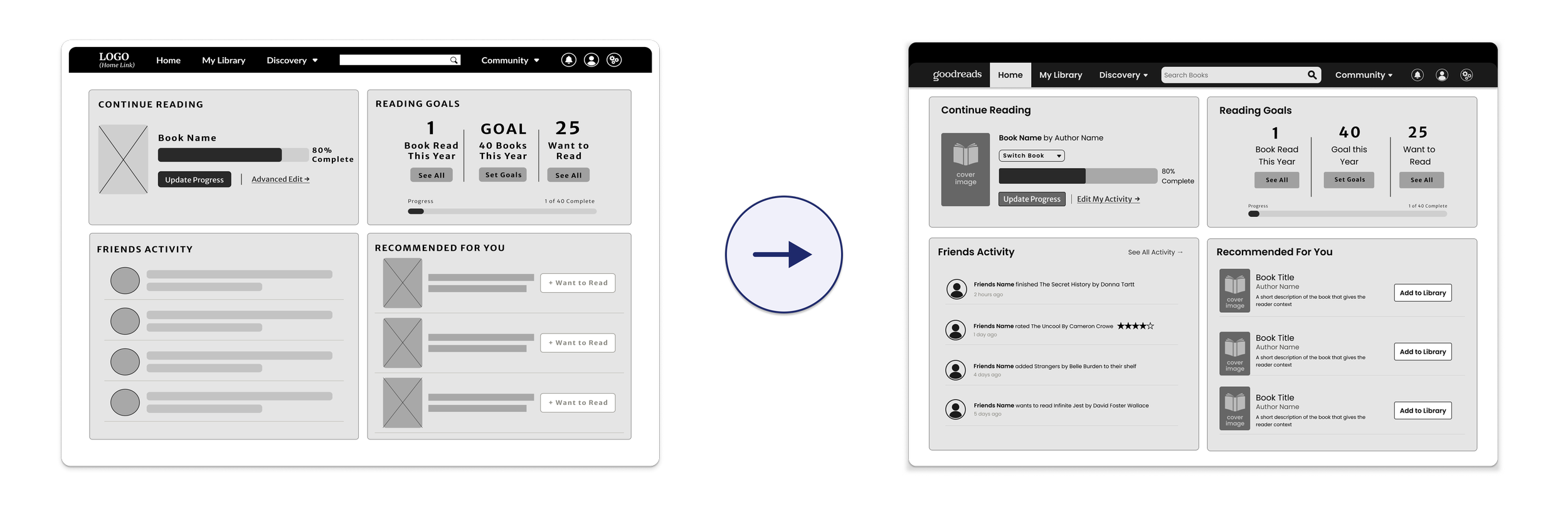
Figure 7: Homepage lo-fidelity (left) to mid-fidelity (right).
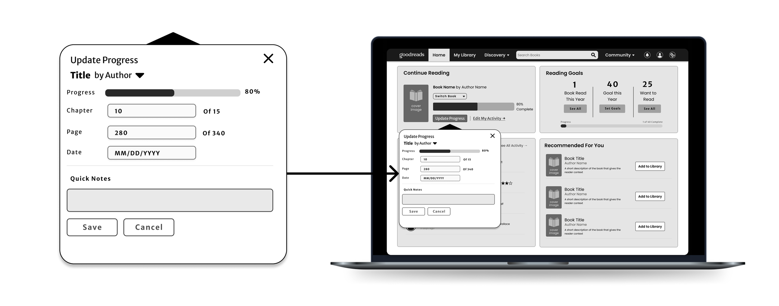
Figure 8: The Update Progress popup on the Homepage allows users to update page count, chapter, date, and add quick notes without leaving the page.
Finding Books With Ease
The current Goodreads search page is almost laughable: a single bar in the center of a blank page with three radio buttons and virtually nothing else. (fig 2) We built this from the ground up.
As seen in figure 9, a thematic discovery grid lets readers who don’t have a specific book in mind browse by feel rather than keyword, like walking up to a curated table in a bookstore. Reader’s Trust puts human sources like Oprah’s Book Club, Staff Picks, and Pulitzer Prize directly on the search page, because our research showed people trust recommendations from recognized voices and sources, not algorithms. A dedicated author search field, genre checklists, and rating filters let readers set precise criteria before searching. As shown in figure 10, active filter tags appear at the top of the results page and can be added or removed as they go. The Sort By bar includes Friends’ Favorites, bringing a personalized social layer into the search. Now readers can find exactly what they’re looking for, or discover something they didn’t know existed.
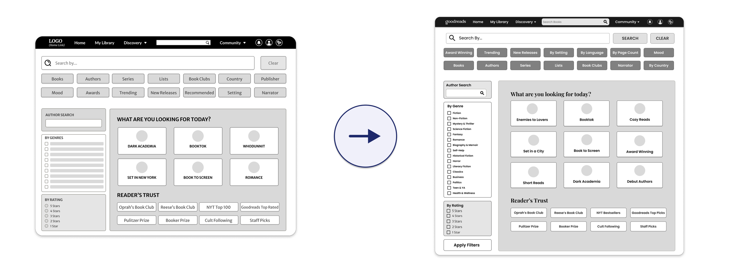
Figure 9: Advanced Search Lo-Fidelity (left) to Mid-Fidelity (right). Thematic discovery grid and Reader’s Trust refined for clarity.
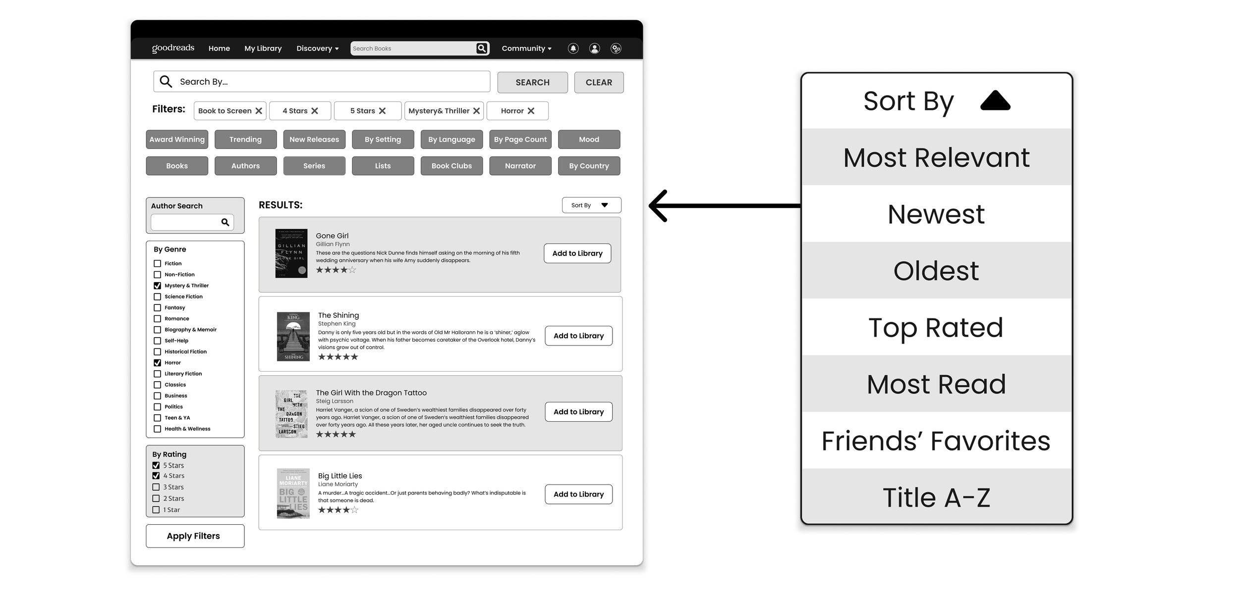
Figure 10: Advanced Search results page with active filter tags and Sory By dropdown.
The Final Prototype — But Not the End of the Road
The prototype was presented to a small group of fellow design students in class as well as submitted as a detailed annotated document walking through task flows, a high level overview of all screens, and low level explanations of every design decision traced back to research.The prototype is built around four specific task flows. View the task instructions here: Task Flow Document then explore the full mid-fidelity prototype here: Goodreads Redesign Prototype.
What Comes Next
The next step is to test the digitally rendered mid-fidelity prototype with new participants and tasks, address any pain points that surface, and move into high fidelity from there. Before taking that on, a more comprehensive design system will be developed to ensure visual consistency across all screens as the prototype increases in fidelity.What made this process feel particularly grounded was that while we were designing, Goodreads added their own progress pop up and a DNF button. Features we had identified as unmet needs through our research. That kind of external validation is rare and it confirmed the work was pointing in the right direction.
Where this Project will Carry Me
UX design cannot be rushed and this project made that real for me. Testing on real people at every stage is non-negotiable because as the designer you are too close to your own work to see its flaws clearly. Small issues caught early stay small. Left until later they become structural problems.I also learned not to jump into Figma too soon. The constraints of components and auto layout can limit thinking before ideas have had room to breathe. My most interesting homepage and search ideas came from paper sketches, not screens.Most importantly, designing with a real goal in mind changes the work. We set out to make Goodreads feel like it belonged to the reader, and keeping that in mind through every phase is ultimately why the screens turned out the way they did.
References
Flood, A. (2013, April 2). Amazon purchase of Goodreads stuns book industry. The Guardian. https://www.theguardian.com/books/2013/apr/02/amazon-purchase-goodreads-stuns-book-industryNorberg, L. (2025, August 9). Goodreads’ first redesign in 20 years: What changed and what didn’t. Medium; Bootcamp. https://medium.com/design-bootcamp/goodreads-first-redesign-in-20-years-what-changed-and-what-didn-t-23589497264cSnelling, G. (2025, July 16). After almost 20 years, Goodreads has a new logo fit for Booktok. Fast Company. https://www.fastcompany.com/91368403/goodreads-logo